In today’s digital age, user experience (UX) reigns supreme. The success of an application often hinges on how well it engages and satisfies its users. This blog post will explore the crucial role that core app dashboards play in enhancing user experience during Entity-Component-System (ECS) development. We’ll provide insights, practical tips, and real-world examples aimed at app developers, UX designers, and tech enthusiasts eager to learn more.
Understanding the Significance of User Experience in App Development
User experience isn’t just a buzzword; it’s a fundamental aspect of app development. A well-designed user interface can make the difference between an app that users love and one they abandon.
The importance of UX lies in its ability to build trust and loyalty. When users find an app intuitive and enjoyable to use, they are more likely to stick around. This, in turn, boosts engagement rates and user retention, which are key metrics for any app’s success.
In essence, good UX is about understanding user needs and creating solutions that meet those needs seamlessly. It’s a continuous process of refinement and enhancement, and core app dashboards are at the heart of this endeavor.
Defining Core App Dashboards and Their Role in ECS Development
What Are Core App Dashboards?
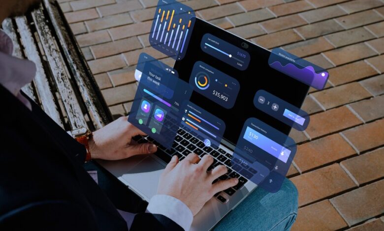
Core app dashboards are the central hubs where users interact with an application’s main features. They provide an overview of relevant information and offer easy access to essential functions. In ECS development, these dashboards are pivotal in organizing and displaying data effectively.
The Role of Dashboards in ECS Development
In the context of ECS development, core app dashboards serve as the control centers. They help manage entities, components, and systems by providing a structured interface. This makes it easier for developers to track and manipulate various elements within the app.
Additionally, these dashboards facilitate real-time data visualization, allowing users to monitor changes and updates instantly. This real-time feedback is crucial for maintaining an engaging user experience.
Dashboards as a User-Centric Component
Ultimately, core app dashboards should be designed with the user in mind. They need to be intuitive, informative, and responsive. By focusing on user-centric design principles, developers can create dashboards that enhance overall UX and drive user engagement.
Key Principles for Designing User-Centric Dashboards
Clarity and Simplicity
One of the most important principles in dashboard design is clarity. Users should be able to understand the information presented without confusion. This means avoiding clutter and ensuring that the dashboard layout is clean and straightforward.
Simplicity goes hand-in-hand with clarity. Rather than overwhelming users with too many options or data points, focus on the essentials. Highlight the most important features and make them easily accessible.
Consistency in Design
Consistency is key to creating a seamless user experience. This involves using uniform design elements, such as fonts, colors, and icons, across all parts of the dashboard. Consistent design helps users familiarize themselves with the interface quickly and reduces the learning curve.
Consistency also extends to the behavior of interactive elements. Buttons, menus, and links should function predictably, ensuring users know what to expect when they interact with the dashboard.
Responsiveness and Adaptability
In today’s multi-device world, dashboards must be responsive. This means they should work flawlessly across different screen sizes and devices, from desktops to smartphones. A responsive design ensures that users have a consistent experience regardless of how they access the app.
Adaptability is also crucial. Dashboards should be able to accommodate different user preferences and needs. This might involve customizable layouts or the ability to personalize certain features, making the dashboard more relevant to individual users.
Best Practices in Implementing Core App Dashboards for Enhanced User Experience
Data Prioritization
Not all data is equally important. One of the best practices in dashboard design is to prioritize the most critical information. This ensures that users can quickly find what they need without sifting through irrelevant data.
Use visual hierarchy to emphasize key data points. For example, use larger fonts, bolder colors, or prominent placement for crucial information. This helps guide users’ attention to the most important aspects of the dashboard.
Interactive Elements
Interactivity can significantly enhance user engagement. Incorporate interactive elements such as charts, graphs, and filters that allow users to explore data more deeply. Interactive dashboards provide a more dynamic and engaging experience compared to static ones.
However, it’s important to strike a balance. Too much interactivity can overwhelm users, while too little can make the dashboard feel static. Aim for a level of interactivity that adds value without complicating the user experience.
Real-Time Updates
In many applications, real-time data is essential. Dashboards that update in real-time keep users informed about the latest changes and developments. This is particularly important in applications involving live data, such as stock trading or social media monitoring.
Implementing real-time updates requires robust backend systems that can handle frequent data refreshes. Ensure your infrastructure can support real-time functionality without compromising performance.
Case Studies: Real-World Examples of Successful Core App Dashboards
App A: Enhancing User Engagement through Data Visualization
App A, a fitness tracking application, successfully used core app dashboards to enhance user engagement. By integrating comprehensive data visualization tools, users could easily track their progress, set goals, and receive personalized feedback.
The dashboard’s interactive elements allowed users to explore their workout data in various formats, such as charts and graphs. This made the app more engaging and helped users stay motivated.
App B: Simplifying Complex Data for Better User Understanding
App B, a financial management tool, leveraged core app dashboards to simplify complex financial data. The dashboard provided a clear overview of users’ financial health, including income, expenses, and investments.
Through consistent design and prioritization of critical data, users could quickly grasp their financial situation and make informed decisions. This simplicity and clarity significantly improved user satisfaction and retention.
App C: Real-Time Monitoring for Enhanced User Experience
App C, a social media analytics platform, implemented real-time monitoring through its core app dashboard. Users could see live updates on their social media performance, including engagement metrics and trending content.
The real-time functionality enabled users to respond promptly to changes and optimize their social media strategies. This immediacy and responsiveness made the app indispensable for social media managers.
The Future of User Experience and the Ongoing Evolution of Core App Dashboards
Evolving User Expectations
User expectations are constantly evolving. As technology advances, users demand more sophisticated and intuitive interfaces. Core app dashboards must evolve to meet these changing expectations, incorporating new technologies and design trends.
Integration of AI and Machine Learning
The future of core app dashboards lies in the integration of AI and machine learning. These technologies can provide personalized insights and recommendations, making dashboards more intelligent and user-centric.
Continuous Improvement
The development of core app dashboards is an ongoing process. Regular updates, user feedback, and performance analysis are essential for continuous improvement. By staying attuned to user needs and industry trends, developers can ensure their dashboards remain relevant and effective.
Conclusion
Core app dashboards play a pivotal role in enhancing user experience in ECS development. By adhering to key design principles and best practices, developers can create dashboards that are intuitive, engaging, and responsive. The examples of successful implementations demonstrate the potential of well-designed dashboards to improve user engagement and satisfaction.
The future of user experience lies in the continuous evolution of core app dashboards, driven by user expectations and technological advancements. By staying ahead of these trends, developers can create dashboard experiences that truly resonate with users.
Ready to take your app’s user experience to the next level? Start leveraging the power of core app dashboards today and see the difference they can make.